
How to Implement a Mobile Website That Ranks in Google?
One thing is pretty clear with Google’s mobile-first announcement that mobile version of websites is not an option anymore, but is a necessity now.
If you don’t have a mobile version of your website and your website visitors are mainly mobile users, then you’re in serious trouble.
Why?
Coz, it is clearly stated by Google that a bad mobile searcher experience can degrade your search rankings as well as displays a warning signal to users stating the site is not mobile friendly!
Fortunately, you can save your website from such penalties by implementing the mobile version of your website.
Well, today I’m going to explain all the methods with which you can implement the mobile version of the website (with a focus on mobile SEO).
There are 3 ways to implement your mobile website –
- Separate URLs – Also known as “M” configuration.
- Dynamic Serving
- Responsive Web Design
You would also like to read –
- Google’s Mobile-First Index and it’s Impact on Mobile SEO
- Mobile SEO tools that will Help you Optimize your Website for Mobile Search.
Table of Contents
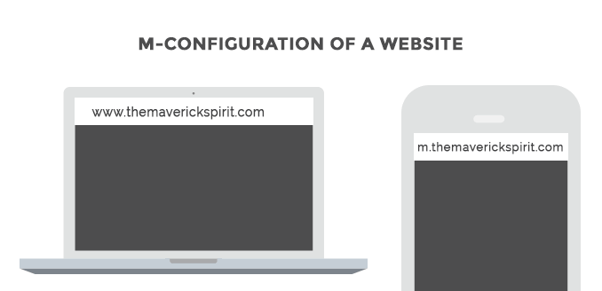
1. Separate URLs – Also known as “M” configuration
As the name suggests, both desktop and mobile versions of a website have different URLs that serve different versions based on the screen size of the device.
Mobile version is also known as the “m-version” of the website.
M-versions were pretty famous back in the time, but not anymore.
Why? Because…
- They’re a huge pain to manage.
- Every time you publish a new blog post or update an old one, you need to create and adjust the content, images, and page elements on your mobile site as well.
- Not only content, but you also need to update structured data and metadata.
- M-versions comes with some serious SEO issues like multiple URLs for the same piece of content on your site. Though it can be solved using “rel=canonical” and “rel=alternate” tags, it’s extra work anyway.
- The wrong redirection is one of the common issues one can face while configuring the m-version of the website.
So, it’s like a lot of work for fewer results. (or getting less salary for more work and everyone hates that, right?)
My Recommendation for M-configuration In short, I DON’T recommend you to use this configuration method for your website. It will only make your Mobile SEO worse, if not configured and managed properly.
What If I Already Have “M-version” Configured In My Website & Not Planning To Switch?
If your site already have a separate mobile site and you don’t have any plans to switch to the mobile-responsive website!
Well, in this scenario, you just need to add your mobile version of the website to Google Search Console.

And it would be great and best if you decide to switch to a mobile-responsive website to prepare your website for Google’s mobile-first index.
2. Dynamic Serving
When dynamic serving is configured, the server responds with different HTML and CSS on the same URL depending on the visitor’s device.
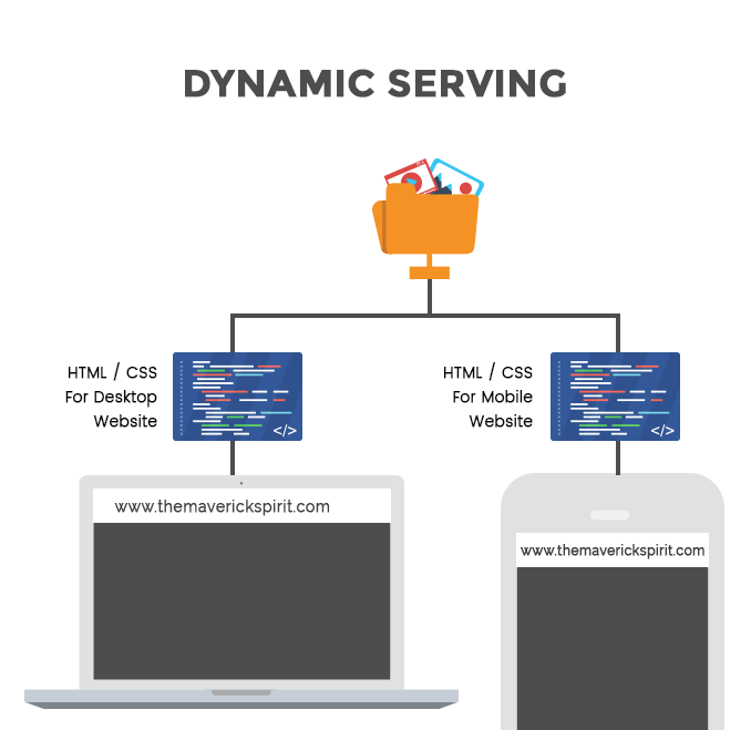
It simply means that mobile content will be hidden when the website visited on the desktop and vice-versa. But that doesn’t mean your site content is responsive.
The server decides which version to serve depending on the user-agent. User-agent is detected by using the Vary HTTP Header.
Dynamic serving is definitely a better solution for SEO when compared to “m-version” for your website. But it has issues as well.
I will not recommend you to go for dynamic serving because…
- You need to create different versions of your content for all devices that come in different sizes with different aspect ratios.
- The iPad Mini and the iPad Pro are completely different tablets with a great difference in their aspect ratios.
- Similarly if you will compare some more devices, you will start to see the problem.
- And if you don’t, your website may not recognize a new device, and show them a version that looks terrible on that device.
- Again, it’s a huge pain when it comes to managing different versions of a single website for different devices. Isn’t it?
These are the reasons why I DON’T recommend a dynamic serving of your pages to mobile visitors.
3. Responsive Web Design
Responsive Web Design allows the server to send always the same HTML code across all the devices.
CSS plays an important role in making a page responsive as it alters the rendering of the page on the device.
The best part about the responsive web design is that neither we have to use separate URLs nor different versions of the same website for different devices.
When it comes to SEO, Responsive Design comfortably throws other options out of the market because…
- It’s easy for users to share and link a single URL instead of multiple URLs.
- It has minimized SEO issues like duplicate content, “rel=canonical tags” etc.).
- It saves a lot of valuable time as there is no need to maintain multiple pages for the same content.
- It requires no redirection. (which cause SEO issues, slows the site down and degrade site’s user experience)
- It saves resources when Googlebot crawls your website. For a responsive webpage, a single Googlebot user agent needs to crawl the page once, instead of crawling multiple versions of the same page with different Googlebot user agents. This crawling efficiency helps Google to index more of your website’s content and to maintain its freshness.
Using meta name=”viewport” for responsiveness.
A meta tag has been added to let browsers know that this page of the website will adapt to all the devices. This meta tag should be added to the head section of the HTML document.
<meta name="viewport" content="width=device-width, initial-scale=1.0">When this meta tag is absent, mobile browsers sets the default screen width of the page as desktop screen width,i.e., 980px (varies across the devices).
The mobile browser then tries to improve the content’s visibility either by increasing font sizes or by scaling the content to fit the screen.
Obviously, different font sizes will throw an inconsistent appearance for the users and they might have to double-tap in order to zoom and interact with the content.
Google does not consider this type of interaction as a mobile-friendly activity.
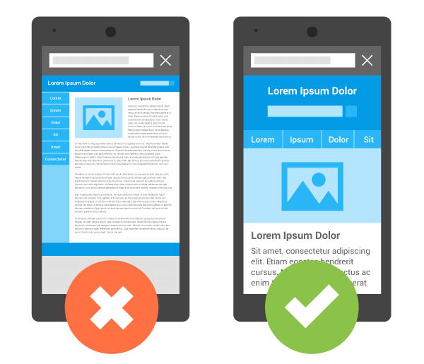
Above image is an example without and with the meta tag for a website.
Wrapping Up
This is it! I have included all the details that will help you to implement a Mobile website that ranks in Google.
My next post in this series would be – How To Optimize Your Website For Mobile SEO or Google Searches?