
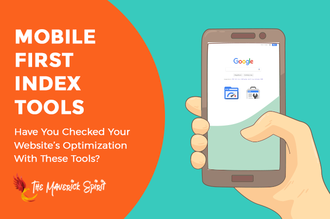
5 Mobile SEO Tools to Perfectly Optimize Your Website for Google’s Mobile-First Index!
Today, I am going to list out Free tools provided by Google to check whether your website is ready for Google’s Mobile-First index!!
But before that, if you aren’t aware of mobile-first indexing I would like you to have a quick look at my previous post where I have given a brief introduction on – What is Google’s Mobile-First index and how does it impact on your website SEO.

Now, before moving on to –
- How to prepare your website for Google’s mobile-first index?
- or mobile optimization,
..you need to find out what elements of your website are working fine and which of them need improvements to offer a better mobile experience and usability.
Analyze your website with the help of the following tools that are capable to check –
- individual pages on your site,
- the status of your entire website,
- and even the mobile and desktop speeds of your website.
Let’s start to explore Mobile SEO tools that will help you optimize your website for Mobile Search –
Table of Contents
1. Google’s Mobile Usability Test
Google’s mobile usability tool identifies posts and pages on your website with usability issues and problems for mobile visitors.
What kind of issues Mobile Usability tool points out?
Well, you might find any of the following errors in the Mobile-usability report –
1. Flash usage
Many mobile browsers still don’t support flash rendering.
2. Viewport not configured
The absence of a meta viewport tag can cause this problem.
3. Fixed-width viewport
Some developers set the viewport width fixed, which is clearly not a good practice for responsive designs.
4. Content not sized to viewport
Absolute width should not be declared in CSS which enables horizontal scroll to see words and images on a page.
5. Small font size
The tool reports this problem when the font size for any page is too small and requires mobile visitors to zoom in on the page in order to read.
6. Touch elements too close
This problem occurs when touch elements like buttons and navigational links are too close or overlap with each other. This overlapping can cause trouble for mobile users.
How To Use Google’s Mobile Usability Tools?
Navigate to Google Search Console > Search Traffic > Mobile Usability.
Google will automatically display all the mobile usability errors if your website has any.
2. Google’s Mobile-friendly Test
The mobile-friendly tool is an easy way to check whether a page on your website is mobile-friendly or not.
How To Use Google’s Mobile-friendly Tool?
You need to follow the below steps in order to test your website on Google’s mobile-friendly tool –
- Navigate to a Mobile-friendly tool.
- Enter the full URL of the page you want to test in the tool.
- The tool will run the test and provides the result of whether your page is mobile-friendly or not.
3. Google’s PageSpeed Insights
Google’s PageSpeed Insights is used by many SEO experts to track and keep reports about –
- the performance of a page on mobile and desktop devices,
- and the suggestions provided by the PageSpeed Insights tool on how the issues can be improved.
What Kind Of Issues PageSpeed Insights Tool Points Out?
It generally gives a score page out of 100, both for mobile and desktop.
It points out issues related to –
- Landing Page Redirects
- Enable compression
- Improve server response time
- Leverage browser caching
- Minify resources
- Optimize images
- Optimize CSS Delivery
- Prioritize visible content
- Remove render-blocking JavaScript
How To Use Google’s PageSpeed Insights Tool?
You just need to put the URL of the page you want to test in the tool.
The resultant report provides the score for mobile and desktop along with the suggestions that need improvement.
4. Fetch As Google
Fetch As Google is a handy tool inside the Google Search Console.
It lets you see how Googlebot crawls and renders your content. It also lets you know if you’ve blocked any resources such as JS, CSS, or image files using robots.txt.
How To Use Fetch As Google?
You just need to follow the below steps –
- Navigate to Google Search Console > Crawl > Fetch as Google.
- You can crawl the home page or any other page just by adding your URL after “/”.
- You can also choose whether you want Google to crawl the Desktop version or Mobile version of the website.
5. Test Mobile Speed Tool
Test Mobile Speed tool reports a bit more information than Google PageSpeed Insights about the mobile version of a website.
It lets you calculate the page speed along with the visitors you’re losing because of slow page speed and how good the connection is. Moreover, email you the detailed report on your website.
How To Use Test Mobile Speed Tool?
- Navigate to Test Mobile Speed Tool.
- Enter the URL you would like to test in the tool.
- It will display the test results along with a screenshot of your website’s mobile version.
- You can enter your email address to get the detailed report along with comprehensive suggestions on optimizing the mobile version of your website.
Conclusion
1. From my experience,
I have listed out all the Mobile SEO tools which are helpful, free, and easy to use & learn and provide the data that will help you make a difference in your mobile SEO.
2. Just one thing we all should never forget,
that at the end we are dealing with real people who are using mobile devices and not just the search engine’s crawlers and their algorithms!!
3. So when you keep real people in mind,
you will optimize your website perfectly for search engines as well as users as it tends to meet their expectations very well.
What mobile optimization tools do you use? Share it with me in the comments!